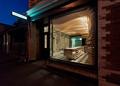
Flour, water, yeast are the main ingredients that go into bread - a simple mix but a delicious and varied result. Well the execution of Baker D. Chirico Bakery in Carlton Australia, March Studio did just that. They mixed simple ingredients - wood, glass and concrete and made an absolutely stunning and perfectly executed bakery. The Melbourne based architectural practice designed a space that to me feels like the inside of a loaf of bread. Using CNC machines, each wooden structure was cut out perfectly to give the space a certain movement and provides a glow of colour and warmth of material one associates with baking. The space was designed for the purpose of providing shelves that help in cooling the bread when it comes straight out of the oven - this way customers can see the bread without any packaging and buy it warm and fresh. To push the design one further, the countertop not only acts as the point of sale, but it is also intended to be a giant cutting board with slats to let the crumbs fall through and a surface that will wear and form a patina with the growth and use of the bakery. Is there anything this design team didn't think of??
Photos courtesy of Trendland, photographer Peter Bennetts


Oh my goodness, this bakery is just TOO much! Amazing...
ReplyDeleteWow that is so awesome!
ReplyDeleteSuperb!
ReplyDelete