Showing posts with label Architecture. Show all posts

Friday, February 7, 2014

Paradise by the Sea

With all this freezing weather we seem to be having, isn’t it just time for a sunny getaway? I was warmed instantly by this stunning open villa in San Salvador designed by Cincopatasalgato Architecture and was itching to share.  With a palette made of primarily of whites, natural materials and some concrete this retreat really is all about the view and the volumes.  After having to rely so heavily on heating for the last couple of months, wouldn't it be amazing to be able to just forget about the walls?? 


Photos coutesy of Cincopatasalgato Architecture


Monday, December 9, 2013

Massimo Listri - Master of Interior Photography

Every once in a while we are lucky enough to delve into the art world for our clients.  While most of them have incredible art collection and curators who they work with very closely, sometimes we get to put that hat on for them.  I have been fascinated for some time with the work of Italian artist Massimo Listri. Known for masterful eye in capturing interior spaces, he has traveled around the globe photographing some of the most stunning interior architecture. I love how I can get lost in each and every photo. 


Tuesday, November 26, 2013

Equestrian Elegance - Revisited

What happens when you combine the Equine world and one of Frances top designers - a clean, timeless and impeccably detailed space.  Enter François Champsaur and his Yearling Auction House in Dauville, France.  I have a love and fascination with horses and rode for most of my childhood and adolescence (see Equine Elegance post one here) and so for me this is the perfect marriage of the French design philosophy at the moment and one of my lifelong loves. What I find truly amazing about this space is that he has personified the refinement of the equine world in a contemporary way, something that we aren't accustom to - usually it is all about pomp and pageantry.  While I wonder how the space actually functions, for me the aesthetic is so successful that really does it matter? Sometimes not...


Photos courtesy of Francois Champsaur


Wednesday, October 23, 2013

Film Review : Oyler House

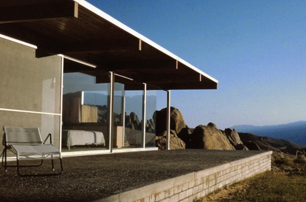
Last week was the Architecture and Design Film Festival her in New York. It was the second year that we attended (see post here) and so decided that we would take advantage of more tittles this year.  Seeing as we just have the weekend we packed 3 feature movies with 4 short films into two days. As with all film festivals some were good...and some were really bad! While couple stand out as really remarkable movies that inspired and motivated us (My Brooklyn - a documentary on the changes to downtown Brooklyn focussing on Fulton Mall, and The Grow Dat Youth Farm - a short documentary on the amazing work being done in New Orleans) one movie stood above the rest.  The Oyler House: Richard Neutra’s Desert Retreat by director Mike Dorsey is an outstanding piece of film making.

Built in 1959 in Lone Pine, California, this bungalow style mid-century modern house is literally all about the view.  With one entire side made of steel-framed glass windows, the house is open to the desert and mountains beyond.  The movie tells the story of Richard Neutra and Richard Oyler and how this piece of architecture played such a crucial part in both of their lives.  With most of the story being told by the incredibly charasmatic Oyler, one really gets a sense of how this house is a truly spectacular piece of architecture.  The current owner, actress Kelly Lynch, and Neutra's son's are interviewed as well helping to round out the perspective of how this house and it's surroundings are truly one of a kind (note the image of the pool below, made from a hollowed out boulder in the on the site).  Dorsey does a wonderful job of bringing the viewer in to the story and helping to make one understand that this is more than just a house.

You can watch the trailer here.  Keep an eye out for the film on Netflix or iTunes, it really is worth a watch and I would love to hear if you have seen it/when you see it, and how it has inspired you.


Friday, October 18, 2013

All in the Detail

Happy Friday all. It has been a great week of travel - another trip to Florida - and client meetings. I was doing some research into modern staircases and found this amazing images that I wanted to share.  I think that so often we as designers get caught up in trying to re-invent the wheel when coming up with an idea for our clients, however nothing is really 'new'.  Well that is exactly what I love about this staircase - it is a simple stair, however with the use of two different finishes of wood, and a clever design detail, you get something contemporary while still being timeless.  Very clever and very sharp!


Tuesday, September 17, 2013

Beauty in Brazil


Set just outside Sao Paolo, sits the wonderfully elegant linear architectural wonder that is Casa Lee.  By the always stunning modernist firm Marcio Kogan Architects, the house is nestled into the tropical landscape in true Brazilian style.  Set in it's lush surroundings, the house has an amazing ability to morph the interior spaces into the exterior with teak flooring becoming decking and glass walls sliding away.  The materials are simple, elegant and support the grand architectural gestures simply and elegantly. 


Saturday, September 7, 2013

Farnsworth House

I am so pleased to have a guest here with us today - my father!  When my parents were visiting a couple of weeks ago we did a little architectural tour of Connecticut.  Before arriving in the New York area however they spent a little time in Illinois, visiting Mies van der Rohe's Farnsworth House just outside Chicago.  Seeing as my father is an architect and architectural professor in France I thought that this would be a great opportunity to have him write about Mies' glass house seeing as I spoke about our trip to Johnson's house here.  Merci!


Visit to the Farnsworth House - Plano, Illinois
designed by Mies van der Rohe 1949 1951


This summer we had the privilege delight of visiting the Farnsworth House. Coming from Europe we booked our visit long time in advance. The tickets, the authorisation to have inside private photography, the car, the GPS, all were ready even the sun was at the rendez-vous.
An hour and 15 minutes from downtown Chicago we arrived in rural, farmland Illinois. Along a small country road a sign indicate the “visiting centre“.

After the formalities we watched a short movie that introduced us to all the details related to the history of the house: Dr. Edith Farnsworth, Ludwid Mies van der Rohe, how they met at a dinner party where she had apparently organized to be sited next to him, how she asked him to recommend an architect, and how he said that he could do it.

Mies previous house the Tugendhat dated from 1930 and was a very large house built in Europe with an unlimited budget [1]. So almost 20 years later Mies got the opportunity to build a real glasshouse.

By that time Mies was well established in North America, he was the dean of architecture at IIT and had gained recognition. With the Farnsworth commission he was given the opportunity to build a project that would represent his ideas about architecture.

Indeed the Farnsworth is the realisation of Mies’ ideals:
“The Farnsworth House consists of three horizontal planes: a terrace, a floor and a roof. Welded to the leading edge of each plane are steel columns that keep them all suspended in mid-air. Because they do not rest on the columns, but merely touch them in passing, these horizontal elements seem to be held to their support by magnetism. Floor and roof appear as opaque planes defining the top and bottom of a volume whose sides are simply large panel of glass. The Farnsworth House is, indeed, a quantity of air caught between a floor and a roof “[2]

Finished in 1951 it is still a grand lady worth the detour.


[1] I would recommend reading the book by Simon Mawer “The Glass room “ Little, Brown Book Group a fictional account of the history of that house.
[2] H.R. Hitchcock, A.Drexler, Built in USA : Post-war Architecture, NY, Simon and Schuster 1952 p 20-21


Saturday, August 31, 2013

The Glass House


My parents were visiting this past week and so in true 'holiday with my dad' fashion we went on an architectural tour of Connecticut last Saturday.  Since there was so much to see I will be splitting out our day over several posts (even keep your eye out for a guest post) and what a better way to start then with our first stop Philip Johnson's Glass House.  


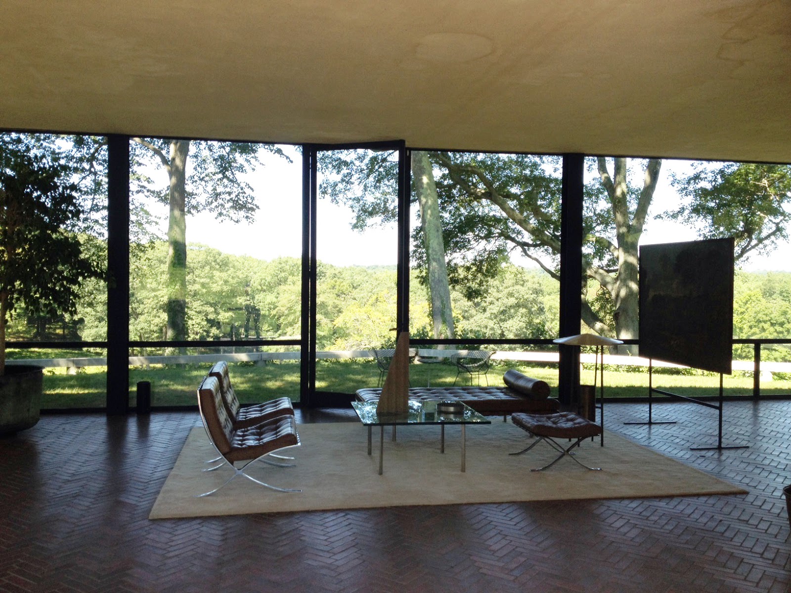
Completed in 1949 this building, just shy of 1,800 sq.ft. was built as a weekend retreat for Johnson and his partner.  With relatively uninterrupted views over the surrounding woodlands, this 'pavilion' as it's called, really is a little piece of heaven.  Large glass panels make up the walls - even called by Johnson as "expensive wallpaper" - with steel structure that sit at each of the four corners.  The palette is simple and uncomplicated really allowing one to feel as though you are part of the surrounding landscape. The glass walls are cleverly punctuated by a centrally located full-height door on each side, giving the house a great through draft and keeling the symmetry apparent.


The only solid structure of the house is a brick-clad cylinder that houses the bathroom on one side and the fireplace on the other.  The interior of the bathroom is covered with green mosaic tiles that mimic the greenery outside, and then a completely decadent leather ceiling. LOVE! The house is furnished almost entirely by Mies van der Rohe furniture which came from Johnson's New York apartment.


On the property there are several other buildings acting as art galleries for Johnson's extensive collection and a guest house - known as the brick house as it's exterior walls brick, punctuated only by three relatively small round windows the back.  Only an hour drive outside of Manhattan the house is in New Canaan and would be appreciated equally by those in the design field and those not.  


Tuesday, August 13, 2013

The Detailed and the Modern

I am working on a project in Greenwich which is a traditional stone house, however the clients - a younger couple - have a more simple modern sensibility. I've been looking for concept images with more detailed interiors filled with simple clean furnishings. While the images below aren't really appropriate for this house they are a wonderful mix of ornate architectural details with contemporary furniture and fittings.  Published in Elle Interior Sweden last year, one really does get a sense of how these people live and how a room with striking details and great volumes can really hold it's own with whatever furnishings you see fit.  I just love the green colour of the dining room walls. Happy Tuesday all!


Petra Whips for Elle Interior Sweden


LinkWithin

Related Posts Plugin for WordPress, Blogger...